A New Logo
| 1 Comment |We have a new logo! It’s quite a change from our first logo that was very simple with a circled 3G. It served it’s purpose and I’ll miss it (well as much as you can miss a logo). It allowed people to easily recognize us as 3G and triple G. We’ve kept the 3 and the G and centered the design of the logo around what we do.
![]()
Layers
Our new logo centers around layering. The 3 is layered on top of the G. We are constantly creating HTML elements from the layers in Photoshop. Websites, themselves, have 3 layers. A server/platform layer, a style layer and then a content layer. This is often referred to as Model, View, Controller (MVC).
Color Palette
The main blue color has not changed. What has changed are the addition of different tints/shades of the main color. Because of the layering effect, different tints and shades come off of the main color making a semi-monochromatic palette.
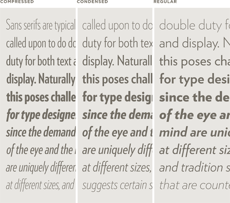
Typeface
We’ve moved away from Helvetica Neue. We still love Helvetica, but wanted to match the logo mark with a font that had similar geometric lines. Verlag was perfect. It’s just a coincidence that Verlag comes in 3 widths.
What do you think?
We’re pretty stoked about it! But, what do you think? Take a second to leave a comment about our new logo,. Whether good or bad, we’d love to hear what you have to say.
I think it looks great! Clean and not over complicated without looking plain.